History of NMSU's Triangular Logo
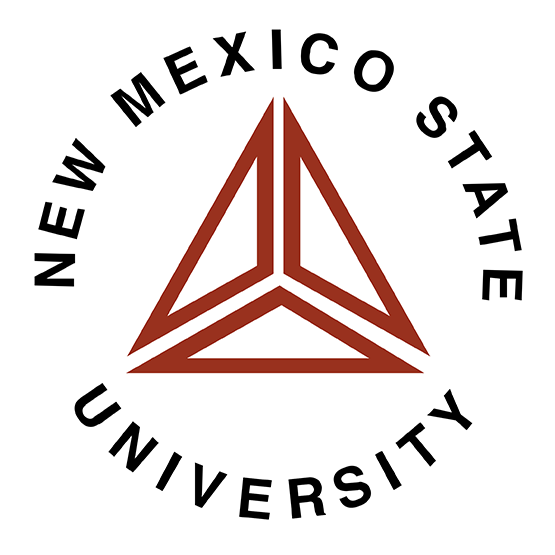
The triangular logo design was created in 1968 to represent the three areas of the Land Grant mission — education, research and public service — and was used in the inauguration of President Gerald Thomas in 1970. In 2005, the university adopted the current state-shaped logo as its official identifier for then NMSU System with the purpose of unifying all of our campuses into a “one university” model. The triangular logo is retired but it remains property of NMSU.
Design of the Triangle Logo
The triangular design was created by NMSU journalism student, John Bryan. Easily recognizable and full of symbolism, this triangular design became the official New Mexico State logo in 1968 — the same year NMSU's identification program began with Jerry Ohsfeldt, landscape architect for the Physical Plant Department, who evolved the triple-triangle design John Bryan initially created.
The President of NMSU at the time was Roger Corbett and he oversaw the transition from the Zia symbol to the triangle symbol. The Zia symbol, although attractive, was felt to represent more of New Mexico than our university although it is still used on our diplomas today with NMSU lettering.
The unique NMSU triangles were created to represent the three areas of the Land Grant mission — education, research and public service. The Morrill Act of 1862 added education, The Hatch Act of 1887 added research and The Smith-Lever Act of 1914 added service through the cooperative extension.
The interior lines represent the historical trails of the New Mexico Southwest. These trails, blazed by such notables as Hiram Hadley, Fabian Garcia, Ralph W. Goddard, Margaret O'Laughlin, Marion Hardman, Danny Villanueva and Clyde Tombaugh, have given a richness to our university.
Design Misconceptions
The notion that the triangular logo was designed to represent just three cultures — Hispanic, Native American and European Americans is incorrect. The triangles represent the historic cultural developments of the area which are broken into three categories:
- 1. The presence of the Native American Indian
- 2. The influence of predominantly Spanish-speaking Mexicans, Spanish and South Americans
- 3. The Movement into the area of Europeans, Asians, and Africans
Overview of Use
The triangular logo was used in the inauguration of President Gerald Thomas in 1970. Dr. Thomas notes Vice President Paul Rader was instrumental in getting the word out about the new logo whose three triangles emphasized the mission of university — teaching, research and public service.
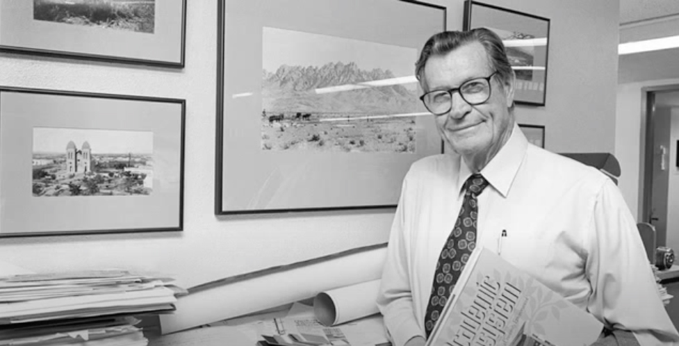
Dr. Gerald Thomas, President of New Mexico State University from 1970 - 1984.
After 34 years of use, it was determined under the Martin administration that the NMSU brand needed to be explored. Under his direction the NMSU brand promise was identified and it was determined how that promise could be made relevant for numerous audiences, as well as determine and articulate what the brand experience should be at each touch point.
In 2004, NMSU worked with a branding agency, Landor, to launch a new branding initiative for the NMSU System with the purpose of unifying all of our campuses into a “one university” model. With that work a new tagline and creative direction was developed, including the implementation of the current logo (the simplified shape of the state of New Mexico). In order to arrive at the decision to change the logo, the company conducted a market research study to uncover perceptions of NMSU, its services, including the existing brand. The research methodology included a variety of on-campus interviews, phone interviews, and online surveys with various stakeholder groups.
One of the research objectives was to “explore the communication value” of the triangle logo using an online questionnaire that was distributed to the members of the NMSU student community in October of 2004. The research sample included a total of 1,643 responses from across academic disciplines. The findings regarding the logo determined that as many as 37% of respondents can’t (or don’t) attach any meaning to the NMSU triangle logo. The most common communication theme among participants was “unity/working together/strength” and that was only 18%. Furthermore, only one tenth of students were aware that the logo represented the university mission of “teaching/extension/research.” With this information, the administration concluded that a revision to the brand should also include a revised NMSU logo as recommended by Landor.